
3D Animation
Realistic or Stylized? A/B Testing Visual Style in a Biomedical Animation
Project Overview
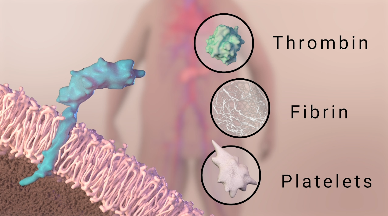
Thrombosis, or the pathological clotting of blood within the circulatory system, is a major cause of mortality worldwide. However, it is often overlooked as a complication in cancer. The risk of thrombosis is higher for cancer patients than for the general population, and it is particularly acute for patients living with late-stage cancers of the pancreas, brain, and gut. A growing body of research shows that tumor cells can release extracellular vesicles which contain tissue factor. Tissue factor is a transmembrane protein that acts as a key initiator of the blood clotting cascade. If extracellular vesicles containing tissue factor make their way into the bloodstream, they may increase the risk of thrombosis in cancer.
For this project, I worked alongside Sydney Agger, a fellow BVIS grad student, to create a mechanism of disease animation that detailed the role of tissue factor-bearing extracellular vesicles in cancer-associated thrombosis. I additionally created a second version of the animation to examine the effects of animation style on education for both expert and non-expert audiences. The project was motivated by a series of publications that detailed the use of different visual styles in depictions of molecular subjects like proteins, membranes, and DNA. These studies established conventions for representing molecules with different levels of surface detail, abstraction, and editorial license depending on whether they were meant for scientists within the field or students. However, no comparable conventions exist for depictions of cellular subjects. This has given medical illustrators and animators a great deal of creative freedom in the “look and feel” of cells and tissues in their visualizations. However, the impact (if any) of these styles on audience learning and trust has not been examined. Therefore, I created a realistic animation in conjunction with Sydney, and then developed a second, toon shaded animation using the same assets, color conventions, and script.
DETAILS
Animation: Ana Beiriger & Sydney Agger
Clients: Robert Flaumenhaft, MD, PhD and Jeffery Zwicker, MD | Harvard Medical School Division of Hemostasis and Thrombosis
Audience: Scientific researchers (primary) and general public (secondary)
Software: Autodesk 3ds Max, tyFlow, Chaos Vray, Pixologic ZBrush, Visual Molecular Dynamics, Adobe After Effects, Adobe Audition
Pre-Production
Sydney and I worked together closely throughout the pre-production process. We developed a script in consultation with our content experts, and used published scientific literature to compile visual references that would inform each major scene of the animation. Working from the script, we divided the animation into six total scenes and each took primary responsibility for three. We created the storyboards for our respective scenes, deciding on a common set of brushes, line weights, and camera notations to ensure that the final storyboard was stylistically cohesive. Before moving into 3D animation software, we also created a style guide that included our color palette, typography choices, and a set of reference images for lighting and materials. This pre-production phase was crucial to the clarity of the final animation, since it allowed us to keep color conventions and color cueing constant across our individual scenes. We referred back to our style guide guide as we worked in 3D, updating it with progress shots and providing each other with feedback to make sure that our final scenes would have a unified look and feel.

Script for the final cut of the animation.

One page (of seven) of visual references compiled from the scientific literature. Used to guide storyboard and 3D modeling.

Selected frames from the animation storyboards detailing scenes 1-2.

Excerpt from initial draft of the style guide.
Developing Two Visual Styles
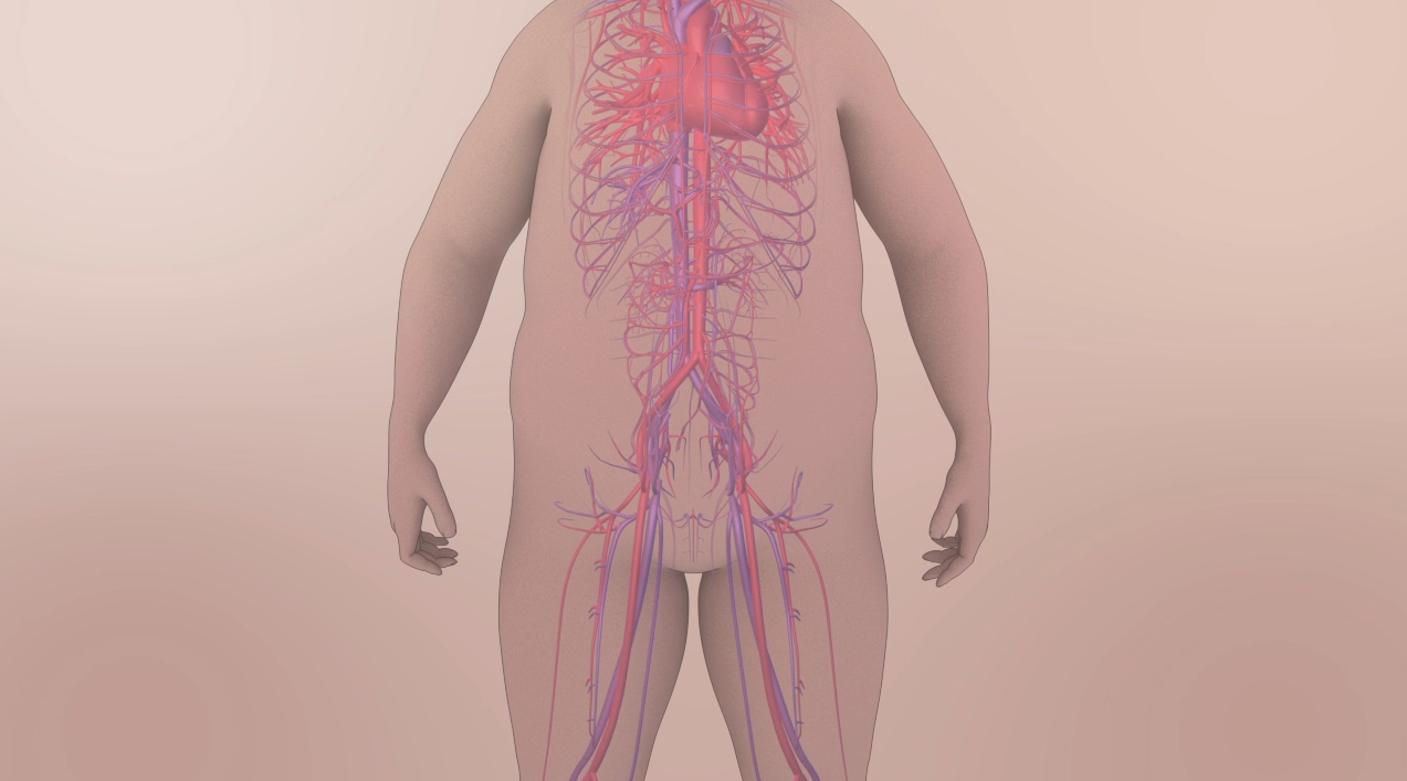
One challenge for this project was to keep the color cueing, composition, and motion constant across both versions of the animation. That way, I could control for the effects of these variables while A/B testing the two visual styles. I developed the realistic style in collaboration with Sydney, who built the introductory scene with the figure and circulation. I was responsible for the cellular scenes, and tried to match cell shape, cell-cell packing, and surface textures as closely to published scientific images as possible to create a look and feel that was “microscope accurate”. In many cases, this meant pulling in texture and displacement maps directly from scanning electron microscope (SEM) images. The pancreatic adenocarcinoma cells were one such case: I tested multiple procedural and composite maps, but was able to best match the fine membrane projections of the adenocarcinoma cells by modifying SEM scans in Adobe Photoshop and tiling them to create the final displacement map.
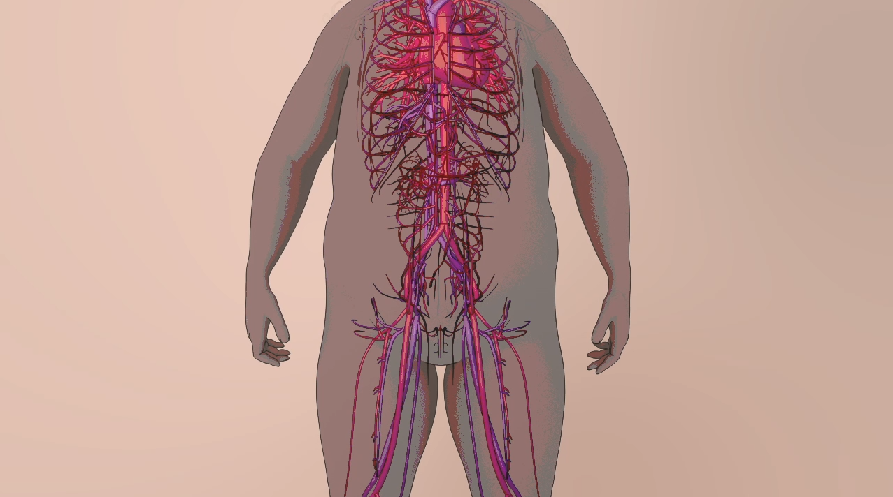
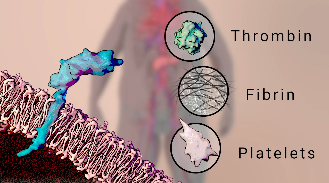
The timeline for this project was relatively short, so I was tasked with turning around the toon shaded version of the animation within about a week after finishing the realistic version. While I considered re-rendering with the VRay Toon Material, the quickest solution - which also allowed for the greatest amount of color fidelity to the original animation - was to posterize the frames in After Effects and use the VRay Toon render element to create outlines that could be flexibly masked and composited. Side-by-side comparisons of individual frames can be seen below.


Final Animation
The animation is currently undergoing A/B testing with a variety of audiences to gather feedback on stylistic preference and learning outcomes.
The final version will be posted after the study is complete - check back soon!